Tuesday, 24 April 2012

Texere

And now for a little light etymology: the words text, textile and texture all derive from the same Latin verb, texere, which means to weave, to plait, or to construct with elaborate care.


I am attempting to construct On Being Soft with elaborate care
(in broken Google Translate Latin, Ego conantur texere libro cum cura); "weaving" together snippets of text and textile, embellishing with embroidery, tall tales, buttons, and beads.


The most recently completed page of the book plays on the shared root of text and texture, texere.


I have cross-stitched the tongue-in-cheek phrases "textually active" and "texturally active" (for which I must give credit to my housemate Mark, as he suggested I stitch up the former of the phrases) on miniscule aida fabric in a plethora of cheap and cheerful colours. The words are surrounded by different textures; light-reflecting orange velvet, a coarse checker-board fabric, thick, fleecy patterned carpet (the remainder of which will make a marvellous appliqued owl one day), antique lace, and plastic buttons.

The book will be both textually and texturally active; made to be read, but also touched.


Monday, 23 April 2012

Wouldn't Say Boo to a Lion


I've just finished the second (though not necessarily Page 2)of the pages to go inside my soft sculpture book, On Being Soft.

This page deals with timidity and bravery. I've wanted to create a work around the phrase "wouldn't say boo to a goose" for quite a while, and when I found the gorgeous African batik fabric shown above for sale in the Significant Seams Hub, I knew I had to use it.

I made a pocket from the geese-print batik for the second of my embroidered handkerchiefs to go into, and made a goose cut-out silhouette from another sheet of batik.


Inside the cut-out I hand embroidered the phrase "She wouldn't say boo to a goose" in tiny, tiny, shy little stitches; text that wouldn't say boo to a goose itself.


The outline of the goose is blanket-stitched and adorned with gold and teal beads. The page background is 1950s gold/yellow brushed cotton.

The handkerchief to be placed inside the pocket of this page is focused on a different animal; the emblem of bravery, the lion.


I recycled a self portrait from my A Levels for this handkerchief; an ultraviolet black and white film photograph of me wearing a lion mask (it was for a study of the photographer Francesa Woodman's work). Due to the use of ultraviolet film, the foliage and skin in the photograph appears incredibly white.

I used photo transfer paper to print the photograph on to a vintage handkerchief.

The fact that the subject is hiding behind a privet hedge whilst wearing a lion mask calls to mind the Cowardly Lion from The Wizard of Oz. The fact that the photograph is in black and white lends itself well to this reference, as the 1939 film of the novel The Wonderful Wizard of Oz is shot in black and white until Dorothy arrives in Oz itself. To continue this theme I embroidered the shoe in the photograph in red; a ruby slipper.

The text that accompanies the embroidered photograph is "I don't see what's so brave about lions, but perhaps it'll help". This is a phrase I've wanted to illustrate for years; I'm glad I've finally got around to it. 

I feel like this handkerchief could be carried in the pocket of a garment as a talisman to bring bravery.

I've just ordered Lion by Deirdre Jackson (part of Reaktion Books' Animals series) in order to learn more about the symbolism of these magnificent beasts.


Saturday, 21 April 2012

Neighbourly Patches

I taught a Neighbourly Quilt embroidery workshop earlier in the week, and yesterday a couple of my friends joined us at the Significant Seams Hub to work on their patches.


Lucy's patch is based around the sharing of cultures in Waltham Forest, with a Diwali-inspired "henna" design.

Nathan's patch features Awesome Games, his favourite shop from childhood, in Walthamstow Market.

Here's a selection of completed patches:


They're coming in thick and fast!

Ah-tisshoo!

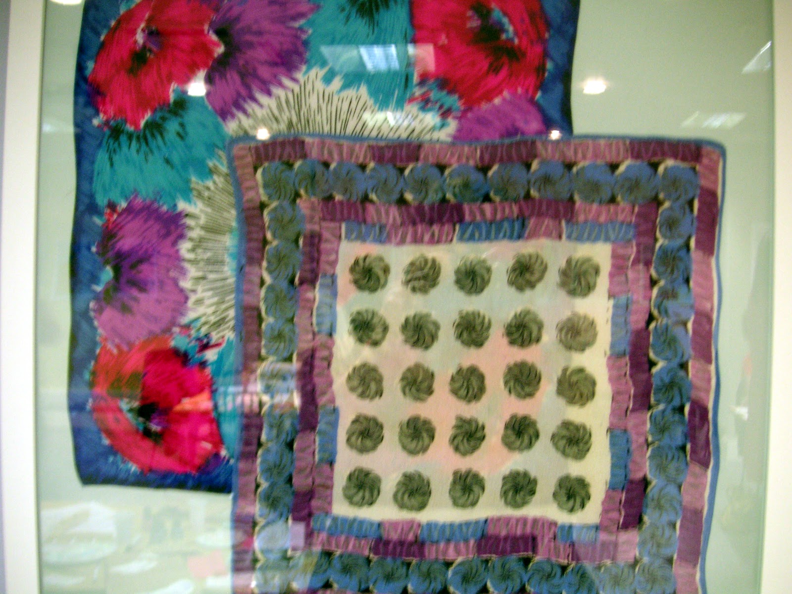
Today I visited the Fashion and Textile Museum on Bermondsey Street to take in their exhibition of handkerchiefs, The Printed Square


The handkerchiefs on display differed from my embroidered vintage handkerchiefs in that they were examples of early - mid twentieth century design rather than handicraft/art.


I didn't visit the exhibition so much for the handkerchiefs on display, however, as for their history.

In The Printed Square, the book published to coincide with the exhibition, the textile and costume designer Nicky Albrechtsen explains how handkerchiefs have played a role in courtship and romance rituals over the centuries.

As far as in known, this began in the Middle Ages when jousting knights would pin a lady's handkerchief - her "favour" - to their sleeve to show for which lady they were riding. 

The word "handkerchief" derives from the French "couvrechef", meaning "head cover". In the Tudor period English women would bestow elaborate "handkerchers" upon their preferred suitors, who wore them on their hats.

In the Victorian era there was even a "language" of handkerchiefs in a similar manner to the language of fans, as Albrechtsen explains; "letting" one's handkerchief "drop to the ground ... was an invitation for friendship; twirling it in both hands indicated indifference; the gentle mopping of one's forehead was a sign of being watched; and drawing a handkerchief across one's cheek signified love".


This may sound fanciful, but would have been an invaluable secret code for strictly chaperoned young women who could not freely express their feelings.


Of course, in the twentieth century, an entirely different handkerchief code came into being; the colour-coded system used by members of BDSM and gay subcultures. A coloured handkerchief or bandana is typically worn in the back pocket to indicate a particular fetish or sexual preference. A handkerchief worn on the left side of the body indicates a "dominant" type, and a handkerchief worn on the right side a "submissive".


Obviously this casual sex handkerchief code is strikingly different from the romantic and rather innocent Victorian one!


On a more romantic note, during the Second World War, soldiers serving overseas sent handkerchiefs hand-embroidered with messages of love back to their sweethearts at home. When I met Carolyn Abbott, founder of E17 Designers,she commented that my Cure for Love embroideries were reminiscent of these war-time embroidered tokens.


Bearing all that history in mind, it's time for me to get back to embroidering my own 'kerchief!

Wednesday, 18 April 2012

On Being Soft

In anticipation of the Soft exhibition at The Mill in June, I am stitching a soft sculpture artist's book. 


The cover is constructed from a 1920s or '30s gold brocade curtain stuffed with wadding, to make the book, well, soft (my friend Alys mentioned that it could double up as a cushion).


The cover reads "On Being Soft - A work in progress by Kate Elisabeth Rolison". The pages inside will deal with notions of softness; of personality, of the female form, with the sense of touch, and more.


On the first page is a pocket made from blue and gold batik fabric, which bears a cross stitched quote by the artist Lily van der Stokker.


The quotation reads "Women can be sweet, sentimental, sensual, communicative, decorative, weak, emotional, and what else? They are very good at crying".


When I came across this quotation in van der Stokker's book It Doesn't Mean Anything But It Looks Good, it struck me that the qualities she was listing could be thought of as different kinds of softness. A particularly feminine softness, which was what I wished to explore in my book. 


I realise that some may see this quotation as anti-feminist, but I feel it (along with van der Stokker's work) celebrates the feminine aspect of womanhood. Indeed, van der Stokker describes herself as a "feminist conceptual pop artist"!


Below are some examples of van der Stokker's work, taken from It Doesn't Mean Anything But It Looks Good, published by Tate St Ives. The works are exuberantly, even nauseatingly, feminine and positive. In her book, van der Stokker is quoted speaking about "the strength of pink curlicues"; there is strength in this apparently "weak" feminine softness. The strength of softness is something we are aiming to explore in the Soft exhibition.


In It Doesn’t Mean Anything But It Looks Good, van der Stokker writes about how when “women refuse to hold back in their expression, we see artworks that are so different they can repulse and confuse us”. In the making of On Being Soft, I am embracing my own femininity, even those aspects of it which I have previously fought and which have nauseated me.


The pages of the book will be made to be touched, and explored; they will contain pockets which will themselves contain embroidered handkerchiefs.


I wanted the first handkerchief of the book to have a dialogue with the Lily van der Stokker quotation cross stitched on to the pocket which contains it. I focused on the last word of the quotation - crying.


The handkerchief reads ""Are you well?" (I'm welling up.)", illustrated by, yes, a wishing well, because I have a terrible weakness for appalling puns.


There are two voices in this text; the first, a polite enquirer, and the second my interior monologue, my silenced voice, bit tongue. The words (and tears) are trapped within the folded handkerchief, and the viewer has to delve into the pocket and unfold the fabric before they are released.

I've begun to think of the different things handkerchiefs can signify; nowadays they are almost invariably only the property of older people. They catch coughs and sneezes, they are witness to outpourings of emotions, they are used to dab away a furtive tear. In old films and cartoons, they wave away maiden voyages, they are waved out of rapidly departing trains at sweethearts. Moving even further (far further) back in time, they were given as “favours” to jousting knights.

On Saturday I will be visiting the Fashion and Textile Museum on Bermondsey Street, where the exhibition The Printed Square: Vintage Handkerchiefs is currently on display. I will report back later!


Tuesday, 17 April 2012

"Art Lasts, Life Is Short"

You may notice that the blog has a new look. This is because I'm embarking on a new project, entitled On Being Soft (which it does say, though not very clearly, on the new blog header. Still, at least it looks soft! My wonderful ex-housemate Dini de-wonkyfied the higgeldy piggeldy hand-stitched text for me.)

The germ of the idea for On Being Soft arose out of a call for artists for an exhibition titled Soft (see what I did there?) which will be shown at The Mill from the 21st June 'til the 15th July. The exhibition will be a collaborative effort between The Mill and Signficant Seams, where I am currently intern for the Neighbourly Quilt project.

In last year's E17 Art Trail, Significant Seams exhibited a Neighbourhood Quilt. E17 residents were invited to add a gold thumbprint indicating where they lived on this quilted map of Walthamstow. The quilt was then exhibited at The Mill.

The Neighbourhood Quilt


For this year's Art Trail we are asking Walthamstow residents to contribute a patch which celebrates what they love about Walthamstow, or what makes good neighbours; hence, the Neighbourly Quilt.

My patch for the Neighbourly Quilt


With my patch, I decided to celebrate both Walthamstow's green spaces and the (oft-mentioned on this blog) arts and crafts pioneer William Morris, who was born in Walthamstow.

I embroidered Morris' motto "Art lasts, life is short" on to an appliqued pollarded beech tree. In the Walthamstow woodland area of Epping Forest these ancient trees are numerous, and many are carved with graffiti stretching back over a number of years. I embroidered the motto as if it was etched into the tree's bark with a knife. This was my first go at applique and gave me a chance to try out blanket stitch and couching. The dark green hearts of the background fabric are the same colour as Waltham Forest's logo, and (I feel) add just the right amount of twee.

As completed patches come in, they are beginning to reflect the diversity of Walthamstow. Each portrays an individual narrative, which when sewn together as the quilt will tell a bigger story of our town.


My friend Lucy working on her patch

If you're a Waltham Forest based textile artist, working in any soft medium, watch this space for details of how to submit work for Soft.

A post on my new project, On Being Soft, to follow.


Thursday, 9 February 2012

Work for Sale

Phew, it's been a busy couple of months! A proper update to follow, but first (although I realise it may be a little late to post this) I will be selling some of the pieces from The Cure for Love at:


Through the talented, enterprising, generally rather wonderful lady who runs Significant Seams.


That's in Wood Street Indoor Market, Walthamstow, (London), this Saturday, from 10am - 5:30pm.


Check out the Market's website; it's going to be quite the day!