Monday, 19 August 2013

Feel Better: An interview with artist Chelsea Dirck


I've followed Chelsea Dirck's work for years; as an angsty adolescent I was comforted by her confessional, diaristic drawings, and now that I am an adult (ha) I deeply appreciate her lo fi, compassionate, analogue art.

I feel like I have somewhat grown up with Chelsea's work (and seen her mature as an artist in turn), and it's possible that her creations have had as much influence on me as, say, Louise Bourgeois.

I hope that my enthusiasm for Chelsea's work translates in the questions I have posed in this interview, which Chelsea has so kindly and thoroughly answered here.

 A great deal of your work seems, at least from an outsider’s perspective, to be an attempt to ameliorate, to console oneself after/during a bad situation and make the best of things. Would you say this has always been/is a constant in your work? 


All of my work comes from a personal viewpoint and I guess, at some point (which could have been very early on) it became very much about trying to make myself and/or other people feel better in some way.I was just writing and drawing for myself and at the time I probably didn't realize that I was as sad or confused as I was. I was just writing about what I knew. 


The diaristic tone of your drawings, celebrating both the good, but not flinching from the bad, the sheer honesty, is encouraging to me. From your LiveJournal days when you shared what seemed to be your innermost private thoughts, to cataloguing those thoughts in zines for public consumption, you seem very willing to lay bare your soul; do you feel this does help to make one “feel better”?

It can be very scary to "put it all out there," but I feel like it is important. It is what is most interesting to me about art and being an artist. I want to be as honest as I can and in that honesty connect with other people. I think that in creating the work it does make me feel better  in some sense. It is cathartic to sit down and make something out of nothing. 


Sharing is a word I often think of when viewing your work, and a mode of operating which seems essential to your practice; sharing hurt, whether personal or public grief (as with the “Feel Better” banners you made to commemorate and ameliorate in the aftermath of the Boston bombings), sharing new artists and music, sharing your gallery space in informal get-togethers, sharing a space similar to your living environment in gallery installations. This may be a trite question, but why is sharing so important to you?


I'm really happy to hear this, because it is exactly the word I want you to think of. Sharing is important to me for so many reasons.


I spent my formative years in a punk community with "do it yourself" ideals that formed the way I lived my life then and now. I think that being a part of punk made me very aware of my community. I was (and still am) always surrounded by very supportive people who encouraged me to make art. It feels very natural to turn around and share that art with those very same people. I don't think that art should exists merely to be bought and sold, to hang on a wall or exist in a museum. I believe that art, like most things, should be made to share with the people who love it or need it. I am a strong believer that if you are interested in something than it is likely many other people will be interested in it- you just have to show them. Similarly- if you feel something, it's likely that other people feel it too. 


Recently there seems to be more of a community feel to your work. Is public art and community engagement something you wish to develop?


To me the idea of community is an extension of the idea of sharing. I am interested in public art to the extent that it reaches a broader audience. I am currently working on "The Feel Good Project" with a friend at work. This project is an effort to use the company's resources to create public art projects that make people feel good. I like the idea of posting things online and how many people can relate and re-blog and add their own commentary, but it feels equally important to go out in to the community I am a part of and actually hand someone an object that they can keep. 

I've been thinking a lot about gifts. I think that is where I am headed with my work. Giving vs. Selling. 


When and why did you turn to fibre as a medium? How do you construct your quilts and banners? Do they start as drawings, scribbled words? Could you describe for us your creative process (in as little or as much detail as you like)?


I have always been really interested in fabric and sewing, but I never knew how to do it. I was just drawn to it for some reason so I started taking some classes while I was in school and ended up landing in the fibers department. I liked how at home I felt there. (I have since realized that a lot of my work references the idea of home and comfort, which fiber somehow naturally lends itself to). 


Most of my work starts in my notebook and then becomes something else (or just stays there forever). So, in the beginning I was doing a lot of drawings with the idea of turning them into embroideries. As time went on the embroideries (still coming from journals) turned into just text, much larger scale than anything else I had been making. I use a simple satin stitch (in and out like regular sewing, nothing fancy) to follow the shape of some text I've written across a large piece of  fabric. It takes forever. I like that about it. When I draw it is quick, there is this immediate satisfaction that sometimes I really need. Embroidery, on the other hand, allows me to slow down and spend a long time with just a few words. It makes the text somewhat like a mantra or something that I live with for as long as I am working on it and then, at the end, it has become monumental in some way. 


I have toyed around with painting large text, but it loses something. With the embroidery you are faced with the scale and it becomes much louder than a small drawing- but it is still soft. It is still quiet and sincere and honest.

(I have also made quilts and banners with appliqued text, but most of the time I am just using the simple satin stitch). 

How does music influence your creative output? Do you see your band, Fleabite, as another artistic medium, another string to your bow?

I don't really think about playing music like I think about making my visual art. I think that it is very similar for some people, but for me playing music has been much more about learning a new skill and connecting with friends in a new way. I don't actually write the music (my other band mates usually do) so it isn't as much of an artistic expression for me. It's just a fun way to spend my time. 


Do you set aside time to work on your observational drawing skills? I ask because a lot of your drawings pair wry or humorous text alongside rather mundane (and I don’t mean that in a negative sense) drawings of interiors or household objects. Do you feel this makes the work more grounded or relatable?

I don't really practice my drawing, but I should. I often draw mundane or household objects because that is what is in front of me. I can't make up something and draw it, I'm terrible at it. I have to look at something so if I feel like drawing I am usually limited to what is in front of me. The drawings with an object and text are usually a result of whatever I am thinking at that moment and whatever is sitting in front of me. To me, it is a record of the moment and the pair makes sense to me, for others it may be more confusing. So, I don't really know if it makes it more grounded, but for me I suppose it does.


Sunday, 18 August 2013

"Will you take the path of pins, or the path of needles?"


In some of the earliest surviving texts of Little Red Riding Hood, when the girl is met by the wolf in the wood, he asks her if she will take the path of pins, or the path of needles. It is of little consequence which path the girl chooses; whichever she does, the wolf chooses the other path and begins a race to get there first.

What is of significance, however, is the objects chosen to name these two paths. One may think that they are appropriate names for paths taken in a cautionary tale, which is precisely what Little Red Riding Hood is thought of as being today; warning girls against talking to strangers and sexual "immorality".

But the tale has roots, like many of the old tales, as a story of female cunning, strength, and coming of age (don't forget in many of the earlier versions of the tale it is Little Red, not the woodsman, who cuts her grandmother out of the wolf's belly).

So, why are the needles and pins of such significance in this coming of age story? Well, according to this (far superior) article, in the French villages where the European version of the fairytale was originally collected, young girls symbolically passed over into womanhood by going to spend one winter apprenticed to a seamstress.

Therefore, Little Redcap's journey up the path of pins/needles possibly symbolises her (potentially dangerous, as evidenced by the wolf) journey into womanhood.

There may be a slightly more arbitrary reason for the pins and needles; fairy tales, or, quite literally, "old wive's tales" were normally shared by groups of women, who gathered to sew, spin, weave and knit. Telling old stories would make these sometimes onerous tasks more enjoyable, and weaving references to their handiwork into the tales was a way of personalising them; of making them relatable.

I've always been intrigued by the tale of Little Red Riding Hood; aged fifteen I completed an embarrassingly shoddy project based on the story for my Art GCSE, and "She whipped a pistol from her knickers" from Roald Dahl's anarchic take on the tale is one of my favourite lines of literature of all time.

It seems that mine and the tale's paths have crossed yet again in the making of the contents of the pocket on the second page of Big Teeth (and the title of the project itself, of course, is partially a reference to "My, what big teeth you have!")

Each of the pockets contains an embroidery alluding to the references to textiles techniques which are commonly found in fairy tales (for the precise reasons I gave above). For this one, I decided to create the clearing in the woodland where the path of pins and the path of needles begin.

By embroidering literal pins and needles along the paths, I am alluding to the dangers the heroines of fairy tales face along their journeys, and perhaps afterwards (I don't believe in happily ever after, particularly not with a "Prince Charming"!)


I decided to stick with black thread to give a flat, story book illustrative style, and I am quite pleased with the results (even if the trees do look like broccoli as a result!)

With the contents of the first page, I was alluding to the ball of string used to escape the maze in the myth of Theseus and the Minotaur, and to the "thread" of bread or pebbles Hansel and Gretel leave in the woods to find their way home by. I indicated this by carving two tiny trees from birch bark and stringing a red thread between them (another allusion to Little Red Riding Hood?)


The text I chose for this piece was "the narrative thread"; the thread which runs through all our lives, and our oldest stories; our myths and fairy tales, which make up so much of our history and culture.


I have but two more little embroideries to complete for Big Teeth, and then I can stitch the whole thing together; I'm actually going to make my deadline for the exhibition at this rate!


Saturday, 10 August 2013

Rest Cure


As much as I do love London, occasionally I need to escape it for a little while. I've been feeling a little disenchanted recently; I think from constantly working so hard on projects, from the long summer which I've been failing to fill effectively, and from spending too much time staring at screens (she says, staring at one!)

So a two week rest cure at my parents' house in the North West Highlands was just what the doctor ordered. I brought my current project, Big Teeth, along with me (and got a surprising amount sewn on the train!) My aim for the holiday was to sit and sew and look out at the sea.

So far it has also included rather a lot of staring at screens (surprise surprise), fine food (and wine!), and the odd walk around the hills and down to the beach. The wild landscape is the perfect setting for constructing a book about fairytales (many of which, of course, had fairly savage beginnings).

First of all, here are some holiday snaps:


An old friend adorning a stone shed on the walk down to the beach (painted by a family friend).

Giant daisies growing against the shed in my parents' garden.

The first bushel of gooseberries grown in the garden; there's almost enough for a crumble!

An entirely unintentional shot of me wandering around in the garden in a lovely dress.
Of course, most of my time has been given over to sewing, and this current project isn't an easy one (but then I'm always one to bite off more than I can chew!)

Someone else who hasn't been finding my sewing easy is our dog, Rosie. A few days ago, the phone started ringing whilst I was mid-stitch; thinking it might be my boyfriend, I got up in a rush, thrusting the embroidery aside. It landed on the dog.


Poor pet!

My reading material for the holiday has been fairly light; I desperately wanted to read The Little White Horse, but couldn't find it at home or at my Grannie's (hers is the house next door to my parents'). Instead, Grannie lent me Linnets and Valerians, also by Elizabeth Goudge. I must admit, so far I haven't touched it; I've been too engrossed in Issue Five of Magpie Magazine, which, as well as being full of beautiful photographs and articles, has quite a number of the best poems I've read in recent years. They've inspired me to write some of my own (not quite ready to share yet, though). My final "reading material" is my previous artist's book, On Being Soft, which is sob-inducingly superior to my current efforts, but acts as a good source of inspiration nonetheless.


And on to those poor efforts! I think my real problem is that the story/poem that runs through the book is rather text-heavy, and my pages are rather tiny!


The first few pages are charmingly off-kilter, but the last couple are so dense the text is almost illegible! The second to last page in particular is just not gelling for me; I think the blanket stitch around the text is too bright. I may unpick it and start again. Also, the last line of the first page is missing and I can't for the life of me find where it's gone! Typical me!


I do like the soft tones of the scanned and cloth-printed Polaroids against the clumsy blanket stitch and the hand sewn text, though, and I am (more or less) happy with every page other than that pesky second to last one. Perhaps I should have stuck to using the same fabric for each page, as I did with On Being Soft. Oh well, I'm sure the contents of the Polaroid pockets will be more impressive. And speaking of, I'd better crack on with them. No rest for the wicked!


Monday, 5 August 2013

Art in Awesomestow: The Summer Show at Penny Fielding


I promised my Tumblr followers a post on my latest exhibition, at Penny Fielding's, quite a few days ago, and so here, finally, is a photograph of Pip and I being smug in our sunglasses in the gallery garden.

And I did have at least one thing to be (slightly) smug about; one of my embroideries was displayed slap bang in the centre of the window! My Melancholyflowers were placed directly beneath a rather charming little crown, which I take as a sign of good fortune.


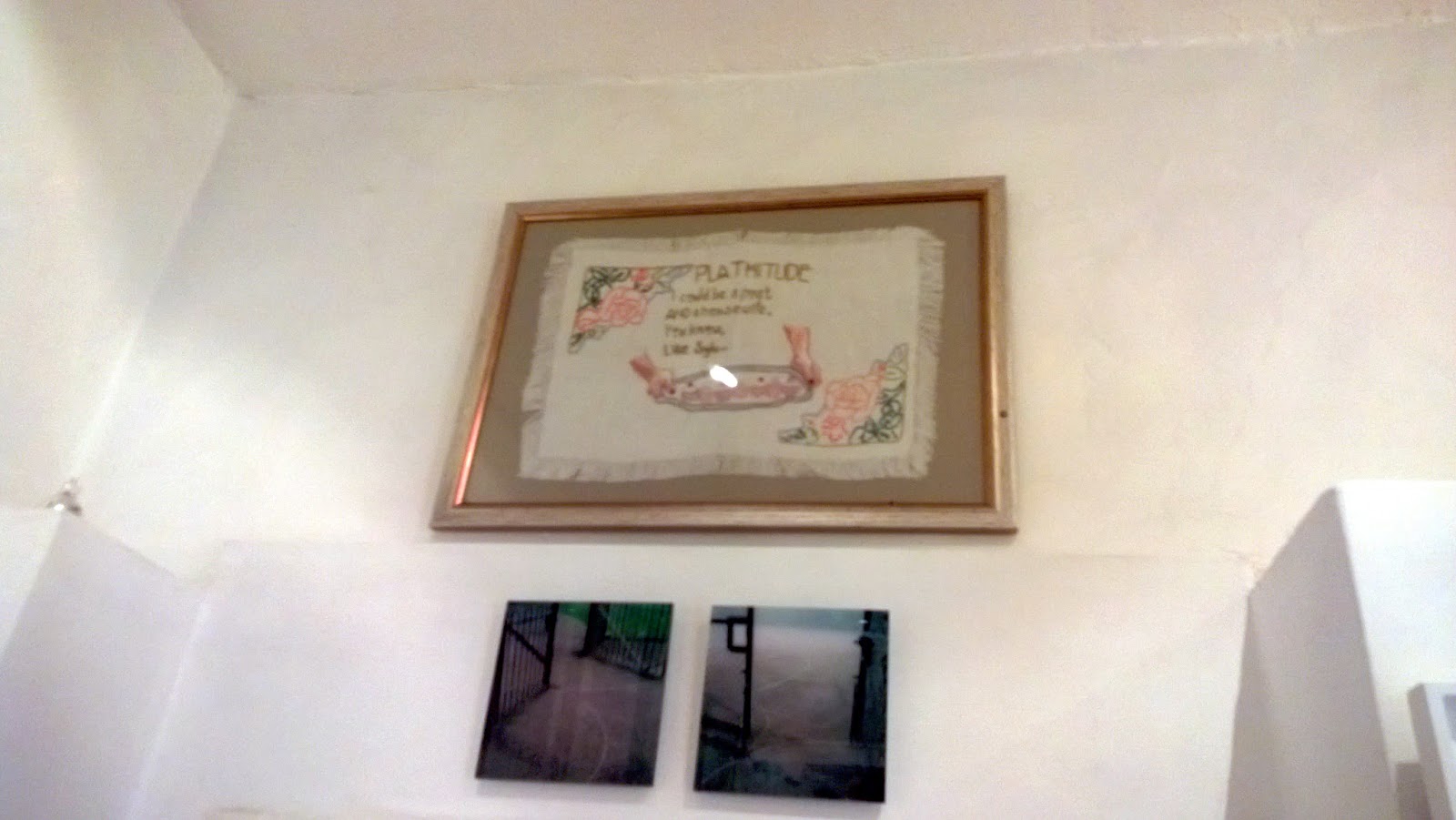
My other embroidery was ever so slightly more out of the way, but still very visible; over a doorway leading to an interesting little nook of the gallery/shop. I'm afraid these are the best photographs I could take of it; it seemed very far up from the point of view of my (brand spanking new, it's very exciting) smartphone!


Here's a better, close up photograph of the piece, entitled Plathitude:


Mine weren't the only textile pieces in the exhibition, or the only familiar ones; this exquisite machine embroidered quilt by Gilli Haqqani previously featured (alongside some of my work) at the Soft group show at The Mill last year.


This colourful illustration put me in mind of Grayson Perry's playful illustrative style. The gaudy yet down at heel carnival scene is quintessentially British.


This photograph doesn't do it justice, but this thought provoking painting by socially conscious artist Alke Schmidt. At first glance it seems obvious that the machinists are working in an Asian clothes sweatshops. But with closer inspection, more layers to the painting are discovered. The painting is overlaid with a textiles pattern, which I read in two ways; it is a traditional Asian design, or a cheap and cheerful design for the mass market. It seems to have seeped into the women's skin; they are unable to escape their cultural heritage, which now includes manufacturing cheap high street clothing for Westerners. Their face masks could be to protect them from their unhygienic working environment; it also reminds me of the hysteria, which seemed particularly concentrated in the East, following the outbreak of SARs and then bird flu, and the wearing of such masks, which I remember was common amongst Asian tourists at the time. Finally, the black mass of cloth waiting to be sewn to the right of the machinists is redolent of the drudgery of working in such a sweatshop, and the murky business practises of the multinational companies overseeing such work.


This whimsical piece put me in mind of sideshows at the carnival or circus; surely that cat shouldn't have wings?! The rough but realistic charcoal strokes give the drawing a naturalistic, endearing quality.


Similarly endearing was this piece; I couldn't decide if it was in pastels or some kind of print, but I do know that I love a good cup of tea, especially when it's served so beautifully!


I feel cruel for writing this, but this dreamlike piece by Two For Joy is very reminiscent of Rob Ryan's work. He certainly seems to have cornered the market in whimsical papercuts! This piece definitely has a charm all of its own, however; the detail on the wings/feathers is particularly gorgeous.


I assume this dramatic print is a linocut, a medium I am hoping to experiment with soon. If it is, it's certainly s masterful one; just look at the detail in that spider's abdomen.


This print of identical twins reminded me of a painting my best friend won a national art prize for when we were twelve, and it's just as sweet!


I love dioramas, but unfortunately couldn't get a better picture of this dinky little one inside an old lamp; it, too, was very sweet.


Much as I love Awesomestow, there are days when it seems a bit grey and gritty even for me! So this bright and cheerful treatment of the borough definitely put a smile on my face.


The exhibition is on until August the 25th. I urge you to get down there if you can. As well as all the wonderful art, there's plenty of beautiful homeware and jewellery on sale, and you're bound to bump into some interesting local characters!